
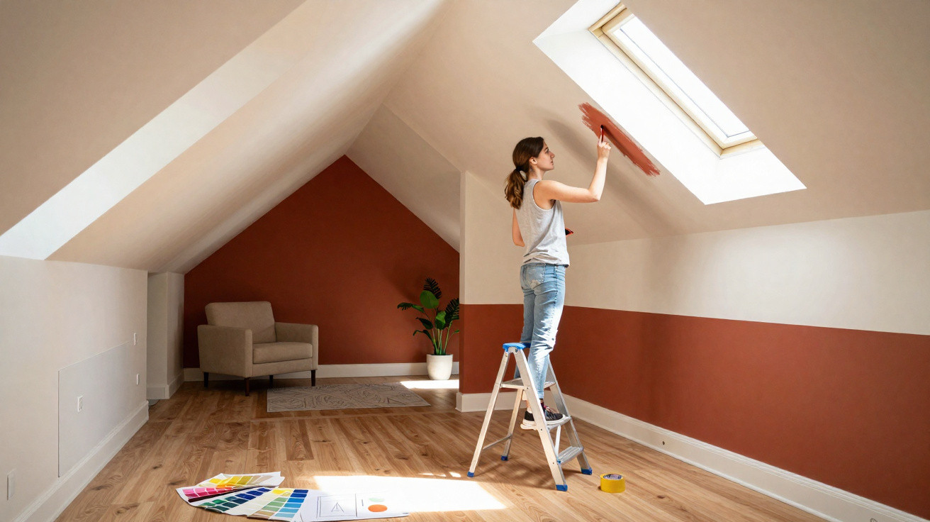
Interior designers are increasingly borrowing an unexpected tool from the make-up bag: beauty-style tricks applied to paint. By placing light–dark contrasts with intent, you can dramatically shift how a room feels - without demolition, stud walls or new furniture.
What “Room Contouring” actually means
In the beauty world, contouring has long been a staple: deeper shades make features recede, while lighter tones lift cheekbones and brows. That same logic is now being applied to interiors. Professionals call it “Room Contouring” - shaping a room using colour.
"The idea: don’t just paint something that looks nice, paint strategically - with a clear intention for every surface in the room."
Rather than keeping everything in one neutral shade, designers use stepped tones across walls, ceilings, alcoves, mouldings and architectural details. The result is deliberately placed light and shadow that guides the eye. The room’s dimensions do not change, but the impression it gives can.
Dark areas appear to fall back; light areas seem to advance. Used well, this helps to “correct” proportions: an overly tall room reads lower, a corridor-like space feels wider, and a vast living area comes across as more inviting.
How colour tricks the eye
This approach relies on how we interpret light and depth. Light surfaces reflect more light, so they feel closer and more prominent. Dark surfaces absorb light, so they seem further away. With that in mind, a few principles can be applied on purpose:
- Dark tones make a surface visually recede and add depth.
- Light tones bring a surface forwards and make it appear larger.
- Mid tones bridge the two, creating softer transitions.
No one gains extra square metres. But the feeling as you walk into the room can shift dramatically. “Too cramped”, “too cold” or “too awkward” often becomes “balanced” and “coherent” - purely through colour choice and where it’s placed.
Too narrow, too big, too awkward: common problem spaces
Long corridor or narrow room
Many homes have hallways that feel like tunnels, or living rooms that stretch almost entirely in one direction. Room Contouring works particularly well here.
- Paint the short end wall darker: it appears closer and reduces the “tunnel” effect.
- Keep the long walls lighter: they recede visually and feel less dominant.
- Slightly darken the ceiling: a shade just deeper than the walls makes the ceiling feel lower and softens the corridor-like character.
This creates the impression of a more compact, less never-ending hallway. In rooms with a window at the far end, it can also work well to paint the window wall a touch darker, so the bright window itself appears to glow even more.
Very large, slightly cold-feeling living space
Big, open-plan living areas may look like the dream on paper, yet can quickly feel unwelcoming in real life. With lots of empty wall space, high ceilings and little structure, the space can make you feel adrift.
In these cases, interior professionals often turn to deeper wall colours to give the room visual weight and a sense of comfort. A richer shade on the main walls makes the space feel subtly smaller and calmer. Using a slightly different tone on the ceiling can separate zones - for example, living and dining - without needing to build a partition wall.
"Dark walls don’t have to create a ‘cave effect’ - used correctly, they give large rooms shape and charm."
If painting everything dark feels like too much, start by deepening just one or two surfaces - such as the wall behind the sofa or the wall opposite the incoming light.
Sloping ceilings, low ceilings and awkward alcoves
Bedrooms with sloping ceilings, or older homes with very low ceilings, can quickly feel oppressive. Here, the reverse tactic helps:
- Make the ceiling and slope noticeably lighter than the walls: they appear to lift.
- Keep the walls a little stronger: they add stability and make the light ceiling plane feel as if it’s “floating”.
- Darken distracting niches: making them deeper in tone pushes them back visually, so they draw less attention.
A room that previously felt like a box pressing down on you can become noticeably airier, with cleaner lines.
Styling architectural features with confidence
Room Contouring isn’t only for hiding things - it’s also about emphasis. Some elements deserve attention, such as a beautiful window wall, an original fireplace or an elegant door.
One popular technique is to treat these features in a lighter, warmer colour than the rest of the room. A bay window or window wall painted in a sunny shade can read almost like its own light source. Your gaze naturally moves there, the room’s depth becomes clearer, and a focal point is created at the same time.
"What used to be seen as a ‘problem area’ becomes the star of the room with just a few brushstrokes."
Bookcases, built-in cupboards and wide door frames can be highlighted in the same way. If you’re feeling bold, complementary colours can be used - tones that intensify each other - such as a muted blue on the walls paired with a warm sand-beige around the window area.
Matte or glossy: why the finish matters
For Room Contouring to look convincing, choosing a colour is only part of the job. The finish plays a major role in whether the illusion works.
- Matte paints reflect very little light. They absorb brightness and create depth - ideal for areas meant to recede, such as a TV wall, a hallway back wall or a reading corner.
- Velvet-like finishes behave in a similar way, but feel softer and more premium.
- Gloss and high-gloss paints bounce back lots of light, emphasise every edge, and can make surfaces appear flatter.
That’s why designers often use matte finishes for the larger planes they want to sculpt. Glossy options are better saved for details that should stand out: doors, mouldings, selected furniture pieces or a lacquered shelf.
"Rule of thumb: create depth with mattness, set accents with gloss."
Practical examples to get started
If you’re trying the idea for the first time, it’s sensible to begin with small, low-risk moves. A few simple applications tend to work in almost any home:
- Make a room look wider: in a narrow space, paint the end wall slightly darker and keep the long walls lighter.
- “Lower” a high ceiling: in very tall rooms, paint the ceiling and the top third of the walls darker, keeping the lower section lighter.
- Zone open-plan areas: in a combined living–dining space, frame the dining area in a deeper tone while keeping the sofa area calmer and lighter.
- Shape a small reading nook: paint the niche and the adjacent ceiling in a dark, matte shade, leaving the rest neutral.
This lets you test how strongly your own perception responds to colour placement - usually far more than you expect.
Risks, common mistakes and how to avoid them
Room Contouring can, of course, go wrong. Randomly adding dark areas can leave the room feeling heavy and visually unsettled. What matters most is having a clear target: what should feel smaller, what should feel bigger, what should feel calmer, and what should feel more present?
A straightforward method helps: before painting, mask off key areas with decorator’s tape and mark them in colour, or use a photo-editing tool to tint a picture of the room digitally. You’ll quickly see whether the idea holds together. In most cases, two or three closely related shades look more harmonious than five completely different ones.
Why the effort pays off
Compared with buying new furniture, building stud walls or installing an elaborate lighting scheme, Room Contouring is surprisingly affordable. A few tins of paint, some time and a considered plan are enough to noticeably change how a space feels. Especially in rented homes - where structural changes are rarely possible - this technique offers a rare opportunity to “fix” proportions.
When you work gradually, you learn with every room. Terms such as depth effect, light reflection and colour temperature may sound abstract at first, but become tangible once you experience them in your own home. Ideally, you end up with an interior that isn’t perfectly symmetrical, yet feels exactly right - simply because colour has been used to skilfully “make up” the space.





Comments
No comments yet. Be the first to comment!
Leave a Comment